


Miller's Law: The UX Secret Behind Interfaces That “Just Make Sense”
How the limits of working memory shape interfaces people can navigate without thinking.

If you’ve ever opened an app and instantly felt lost, chances are the interface was fighting against how your brain actually works. Understanding usability laws and best practices is essential for creating good design and one of the most eye-opening is Miller’sLaw.
In simple terms, Miller’s Law reminds us of a very human limitation:
Our short-term memory can only hold about 5 to 9 items at a time.
That’s it. No matter how smart, tech-savvy, or experienced we are, our brain has a natural cap. And once you cross it? Confusion, frustration, and cognitive overload take the wheel.
But instead of explaining it with theory, let’s walk through it the way we did in our UX Tips series.
Trying to Memorize Everything? Good Luck…
In the previous image, we showed a playful “inventory” full of random items: eggs, beetles, cheese, crowns, tea cups, rubber ducks… you name it.
Could you memorize everything at once?
Most people try. Most people fail.
And that’s exactly the point.
Your brain naturally starts filtering, grouping, or completely forgetting items because it’s not built to remember long, unstructured lists. This tiny challenge mirrors what users experience on cluttered screens or overly complex interfaces.

So What Does This Mean for UX Design?
It means if we want users to feel comfortable (and not mentally exhausted), we need to design with their memory limits in mind. That’s where grouping becomes a superpower.
In the next image, we organized the same items into two simple categories: Breakfast and Animals.
Suddenly everything felt easier to understand.
Why?
Because structured information is instantly more digestible than chaos.
If you’ve ever cleaned your room and thought “wow, it looks bigger,” it’s the same feeling, except for the brain.
Good Design = Less Mental Load
Here’s the magic:
When you limit the number of choices per screen and group similar items, users don’t just understand your interface faster—they enjoy using it.
Miller’s Law reminds us that:
- Too many buttons = hesitation
- Too many options = stress
- Too many unrelated elements = visual confusion
But with good hierarchy, spacing, contrast, and intentional simplicity, users glide through an interface without even thinking about it.
And that’s what all great design aims for.

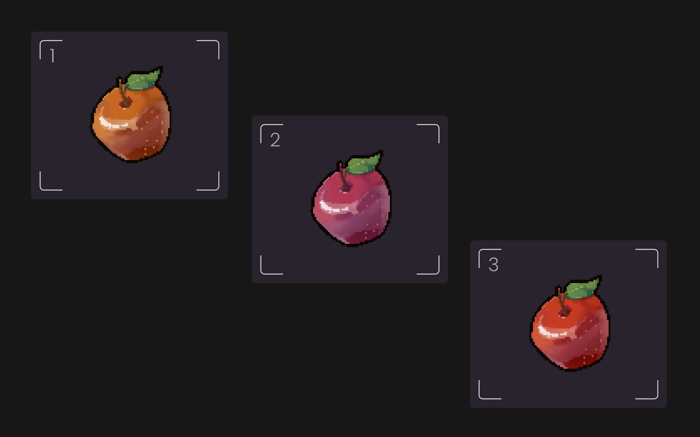
The Answer to the Apple Question
In the inventory challenge, we asked:
What color was the apple?
Most people second-guess themselves because remembering one item mixed among many is harder than it seems.
The reveal? The apple was a pinkish-red one
Small memory tests like this show that even one detail can slip through the cracks when people are overloaded.
Design for Humans, Not Robots
At Digital Ghp, we believe user experience should feel light, intuitive, and enjoyable. Miller’s Law is one of those principles that guides us in every project from apps and dashboards to websites and interactive content.
Because when design respects how the human brain works, everything feels easier.
Want UX that feels effortless? Start by remembering this simple rule:
People remember best when you keep things grouped, simple, and under 9 items.
Your users and their brains will thank you.


