


Tesler’s Law: The Art of Balancing Simplicity and Control in UX
Every product has irreducible complexity — the craft is deciding who carries it, the user or the design.

Every designer has faced the same dilemma: How simple is too simple?
And how complex is too complex?
Tesler’s Law, also known as The Law of Conservation of Complexity, gives us an answer that’s surprisingly straightforward:
Complexity can’t be removed, only shifted.
No matter how elegant a design looks, the total effort required to complete an action has to live somewhere, either the system handles it or the user does. That’s the game.
And speaking of games…
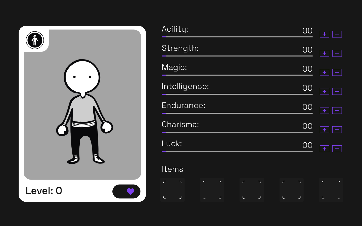
Think of UX Like Building a Game Character
When you start with a blank character, things feel simple: a basic avatar, no stats, no items, no decisions. Pure clarity.
But what you gain in simplicity, you lose in control.
You can’t customize or strategize. You’re stuck with a character that does… well, nothing.
Now compare that to a leveled-up character with agility, intelligence, strength, and an inventory of tools. It’s more complex, yes—but it also gives you freedom, identity, and functionality.
That’s the heart of Tesler’s Law:
You trade simplicity for power, or power for simplicity—never both at the same time.

Complexity Isn’t the Enemy—Uncontrolled Complexity Is
Think in this character construction example, when you boost agility to sneak past enemies, you’re shifting complexity into the stat-building process. When you choose between a dagger, a mask, or a potion, you’re making decisions that increase cognitive effort, but that effort gives you control.
Now imagine a design that removes all that complexity “to make it simpler.”
No stats.
No items.
No choices.
Sure, it’s easy—but it’s not useful.
This is what Tesler warns us about: oversimplification leads to shallow experiences, while overcomplication creates barriers to entry.
Good design sits right in the middle.
So What Does the “Middle” Look Like in UX?
Here’s what designers can learn from Tesler’s Law:
1. Decide who should handle the complexity
Does the system automate steps for the user?
Or does the user need to make decisions?
There’s no right answer—only the right balance for your product.
2. Simplify the surface, not the functionality
Visually simple interfaces that still contain meaningful depth and control.
3. Hide advanced features (but don’t remove them)
Power users love control.
New users love clarity.
You can serve both.
4. Prioritize clarity over minimalism
Minimal ≠ simple.
Clear > clean.

Bringing Tesler’s Law Back to Design
Tesler’s Law isn’t a warning, it’s a framework.
It reminds us to ask:
- Where does the complexity live?
- Does this interface overwhelm or empower?
- Have I removed something essential in the name of simplicity?
- Is the user making meaningful decisions or unnecessary ones?
The trick isn’t eliminating complexity but designing its placement intentionally.
When designers strike that balance, products feel intuitive without feeling limited.
Flexible without feeling chaotic.
Simple without feeling empty.
And that’s where great UX lives—right between effort and ease.


